


You love the idea of a print piece that flips, shifts, or seems to pop off the page, but getting there without blowing your budget feels risky. Perhaps you have given out a project and received something flat, blurry, or nothing like what you had imagined. Or you are looking at the campaign deadline now, and you just do not know what to even request your designer to do.
The good news is that a lenticular project is not required to feel like a gamble once you have the idea of how the process works. Each strong lenticular object passes through the same clear steps, beginning with the selection of the correct effect and concluding with the acceptance of a final proof prior to printing.
This article takes you through what that process actually looks like, so you know what to expect and what to request during the process.
1. Define The Goal — What Should the Viewer Feel or Notice?
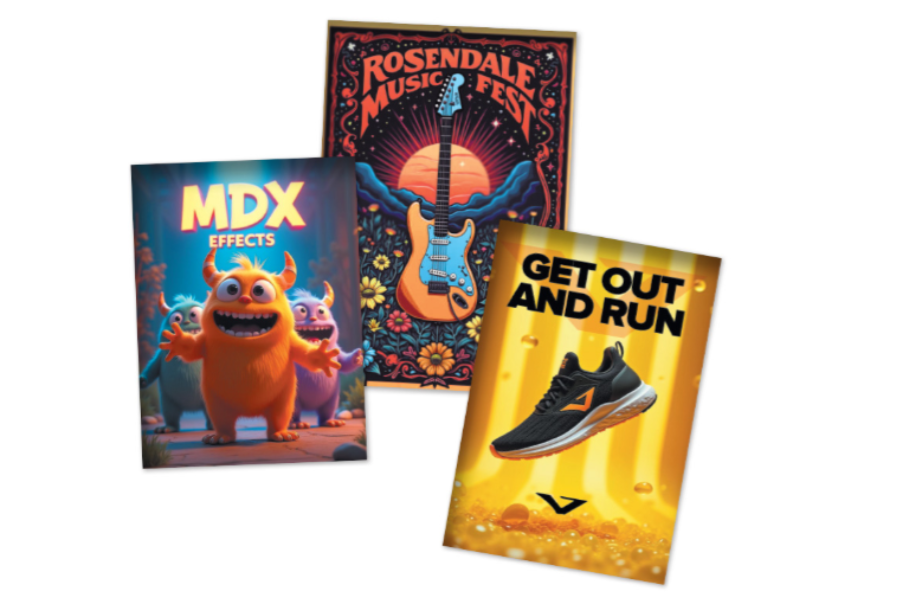
Before any artwork gets built, the first real decision is what you want your audience to feel when they see the piece. Are you going for a surprise reveal, real depth, or a story told through movement? A lenticular design guide breaks these effect types down clearly.
A flip effect is suitable on two opposite images, such as a before-and-after or two angles of a product. A 3D effect provides depth to a single scene and draws attention to posters or displays. Motion works with multiple frames to demonstrate movement, which is ideal in demos or short stories.
The location where the piece will actually be used is equally important as the effect that you choose. A postcard in the hand of a person does not act like a sign that people pass in a shop. Decide on this point early to have the entire project run more smoothly.
2. Plan The Design Around the Lens, Not the Other Way Around
The physical lens starts calling the shots on design as soon as you settle on an effect, not the other way around. Lenses have a direction, and that direction decides how the image shifts as someone views it. Handheld pieces usually work best with a horizontal shift.
Larger, fixed pieces need a vertical shift instead. People walk past them side to side rather than tilting them in their hands, so the movement has to work that way too. This choice also affects text size, since small type can disappear once the lens goes on.
Size and thickness limits follow the same logic, since bigger prints usually call for a different lens setup. Knowing this upfront keeps your budget and timeline realistic. It’s a technical step, sure, but skipping it is how projects go sideways.
3. Build the Art with the Illusion in Mind
Your designer moves into building artwork the moment the effect and lens are settled, and this is where the illusion takes shape. For 3D pieces, that means working in layers, with one set as the focal point for your logo or message. Strong source photos move this stage along faster.
Color choices matter more here than typical design work. Light or plain backgrounds can cause a blurry, doubled look called ghosting, so bold colors with full ink coverage tend to work better. That’s why a designer might push back on a soft, pastel palette.
For motion pieces, keep the background steady across every frame so movement reads smoothly instead of chaotic. One part of the design should stay still, since constant movement tires the eye fast. Fewer, well-planned frames almost always beat a crowded sequence.
4. Prepare and Proof the File Correctly the First Time
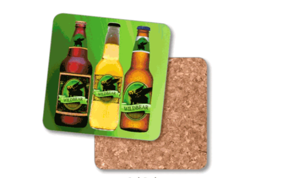
Even a great concept can fall apart if the file behind it isn’t built right. Your designer needs to prepare artwork at a specific resolution and color format so the print stays sharp once it meets the lens. You won’t build this yourself, but knowing it exists helps.
Extra space around the edges, called bleed, gives the piece room to shift slightly during production without cutting anything off. This matters even more on 3D pieces, where layered depth needs a little extra room. Skip it, and your first proof probably won’t come back right.
Before anything goes to print, take one more pass at font sizes, layout, and your message with fresh eyes. A short proofing step now beats a costly reprint later. It’s not the fun part, but it protects everything built before it.
5. Interlace, Print, and See It Move
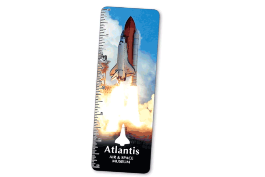
The file goes through interlacing after it’s approved, and specialized software lines the artwork up with the physical lens. This step actually creates the flip, depth, or motion effect, turning separate images into one moving print. You won’t see the real effect until this stage wraps.
From there, the piece heads into production, where it gets printed and paired with the right lens sheet. Lens type and thickness vary depending on whether your piece is handheld or built for a large display. Material choices decide how well it holds up over time.
The payoff is a piece that does something a standard print simply can’t. It catches attention through real motion and depth, and watching your design move for the first time makes every earlier step feel worth it. That moment is what a solid process is built to deliver.
Conclusion
A solid lenticular design process isn’t about luck or guesswork. It’s about moving through clear stages in the right order, from choosing your effect and planning around the lens, to guiding strong artwork and approving a clean proof, with each step setting up the next.
Understand what happens at each stage, and you can brief your team with real confidence instead of hoping for the best outcome. Follow this process closely, and your next lenticular piece won’t just print correctly. It will move exactly the way you originally pictured it.